Rust Lifetime Visualization Ideas
Many people have had the idea that there should be a way to visualize lifetimes in Rust. Indeed, the Rust Book used to include ASCII diagrams of lifetimes in some code examples. When fighting the borrow checker, it would be great if the IDE or editor could automatically provide a visualization of the lifetimes in your code. Perhaps the most beautiful visualization I have seen is in the post “Graphical depiction of ownership and borrowing in Rust” by Phil Ruffwind. However, those diagrams take up a lot of space. Some of the code samples have blank lines inserted in them to allow space for the diagram. They aren’t well suited to use in an IDE or editor. However, others have already worked on editors to visualize Rust lifetimes.
Paul Daniel Faria has developed a prototype plugin for the Atom editor that provides lifetime visualizations. There is a long thread on the Rust Internals Forum discussing it. Several people propose variations on how the visualizer should work. The current approach is to select a variable and then visualize the lifetimes and borrows based around that variable. Highlighting similar to selections are used to show the code regions of borrows. The last screenshots provided show the visualization of the lifetime of the target3 variable and then the message variable in the same code sample.
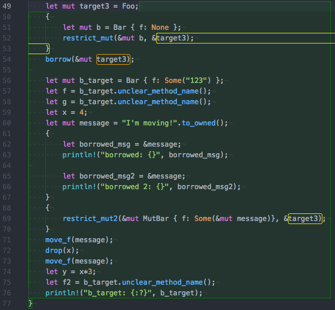
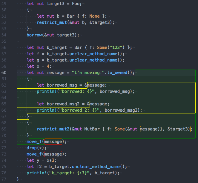
I find these visualizations to be challenging to interpret. The highlighting style isn’t clear enough and is awkward when a single wrapped line is highlighted as with lines 52 and 53 in the first example. I understand this style was probably chosen because it is easy to implement in the Atom editor and I don’t fault the developer for starting there. Also, the fact that lifetimes are visible relative to only a single selected variable is very limiting. Finally, this prototype was done before the addition of non-lexical lifetimes (NLL) to Rust, and it isn’t clear how to adapt it for that. Given these issues, I wanted to imagine what I’d ideally want from an editor in the way of lifetime visualization.
I started with the diagrams in the “Graphical depiction of ownership and borrowing in Rust” post. However, as I said, they are too large to fit in an editor next to real-world code. I took screenshots from (VS Code) and used image editing software to mock up my ideas. After a few iterations, I came up with something that I think could be a good start. By way of example, here is what a simple method could look like:
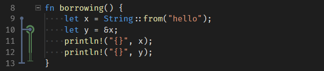
The blue line shows the lifetime of the immutable variable x. The value comes into existence on line 9 as indicated by the blue circle. The variable continues to be live and accessible until the end of the block as indicated by the solid blue vertical line. At the end of the block, the value leaves scope and is dropped as indicated by the blue horizontal bar that terminates the lifetime line.
On line 10, the variable y borrows an immutable reference to x. The green lifetime line represents the reference y. It comes into existence on line 10 as a borrow of x as represented by the green circle around the blue circle that is connected to the lifetime line of x. Values are distinguished from references by use of hollow/double lines instead of solid. Since y immutably borrows x, it is still valid to read from x after it is borrowed. Thus there is no change to the blue line on line 10. Line 12 is the last use of y. Because of NLL, the lifetime of y ends here. However, it would be valid to add lines after this that use y. This is indicated by the thinning and transparency of the yellow line from here to the end of the scope.
That is a trivial example. It didn’t show mutable values or the locking and freezing of variables when they are borrowed. The example below demonstrates how those might be represented.
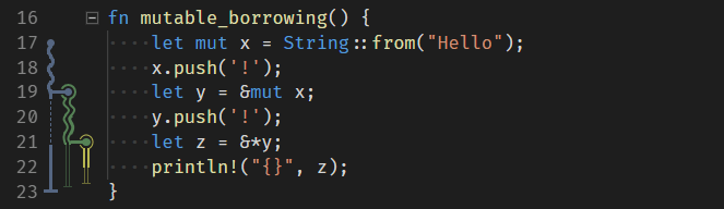
Here, the squiggly or wavy lines represent mutability of values/variables on that line. Thus x starts mutable. However, when it is mutably borrowed by y on line 19, it is locked, and x can no longer be accessed as long as it is borrowed. The thin dashed line represents this. On line 21, z immutably reborrows y. This causes y to become temporarily immutable which means it is now safe to read from x as indicated by its transition to a think solid line. Line 21 is the final use of y and line 22 is the final use of z as represented by the narrowing and transparency of their lifetimes.
These mockups show that it is probably possible to create a lifetime visualization that can be automatically generated by a source code editor and displayed inline with the code. However, these are limited, minimal examples. A full visualization feature would require accounting for many more situations. These would include:
- Moves can be represented similarly to how they are in the graphical depiction by replacing the lifetime line of one variable with another.
- Copies can be represented similarly to how they are in the graphical depiction by forking the lifetime line of a variable into a new variable.
- Parameters might be represented by lifetime lines that start before the function and end after it.
- Lifetime Annotations could be color-coded to match the lifetime line corresponding to them. Additionally, it might be possible to label the line with the lifetime name (for example
'a). - Nested Functions can probably be treated similarly to regular functions, though there may be issues with the lifetime lines of values that span over the nested function definitions.
- Closures will require careful consideration to account for both closure parameters and captured values. Remember that variables can be captured both by borrowing and by taking ownership.
- Struct Fields may pose additional problems since they could be borrowed or moved separately from the containing structure.
- Temporary Values may also need to be represented somehow.
There may be better ways of visually representing lifetimes and their relationships than this. In particular, the following should be considered:
- Is there a way to better connect variable uses to the lifetime visualization? I considered color coding variables to match their lifetimes, but that might mix poorly with standard syntax highlighting.
- Should there be a visual distinction between a no-op drop vs. ones that have an actual drop function? Remember that the call to drop counts as a use of the variable for NLL.
- Is there a better way to represent NLL? An earlier iteration of my mockups had the lifetime lines fading away after the last line they were used on. That produced cleaner diagrams, but it was unclear how long variables remained accessible. One idea is to mark the ends of blocks with horizontal white bars. Thus a NLL would fade out at last use, but following the column down to the first white bar blocking the column would indicate the last line the variable could be used on.
- How should the forthcoming async/await features in Rust affect the lifetime visualization?
- If there are errors in the lifetime relationships, how can these be indicated in a way that makes the issue clear?
- Is there a better way to associate borrows with the value they are borrowing? Currently, a borrow only gives an indication of which value it is borrowing on the first row. In an earlier iteration of the design, the color of the borrowed value continued down the middle of the reference lifetime. I wasn’t able to make that look good, but perhaps a graphic designer could come up with something better.
- Will the visualization remain useful for long or complex functions? In particular, there might be many columns for a function with many variables. Ideally, columns could be reused for different variables after the last use of a variable. However, that interferes with indicating the entire scope a variable might be usable in. There may need to be special handling for such situations. Perhaps the lifetime lines of multiple variables can be collapsed into a single column in certain circumstances.
- Should there be a change to the visualization when a variable is selected? It may be useful to show additional information about connected lifetimes when a variable is selected or to highlight the relevant portions of the visualization. Alternatively, perhaps the main visualization should be simplified and some information shown only when a variable is selected.
- Is there some radically different visualization that would be better?
I’d like to see great tools for Rust development. The Rust Language Server project is a good step in that direction. However, Rust tools would benefit from unique features not supported by the standard language server protocol such as the lifetime visualizations I’ve mocked up. Unfortunately, it appears that VS Code will not allow a plugin to add this kind of visualization unless it completely takes over rendering and editing of the source code. It is likely other editors will be restricted like VS Code. However, I think the Atom editor would allow a plugin to do this. Yet, these diagrams don’t seem well suited to generation with the HTML and CSS that Atom is built on. Given the challenges of implementing a visualization like this, it is unlikely I’ll ever implement it. I invite others to take my ideas and create great Rust tools.
EDIT 2019-02-21: Added bullet item about accounting for async/await features.